We have a few options on the Settings page of our app on how to change the style and functionality of our app. These settings include:
- Border Style
- Sold out Style
- Swatch Size
- Circle/ Square swatches
- Dark Themes
- Tooltips
- + More
How to add CSS snippets
To topThis article has some CSS snippets that you can add to your theme.
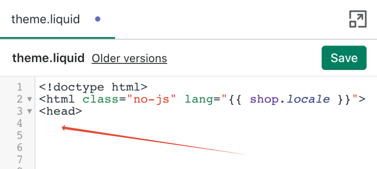
Add the code snippet to your theme.liquid file right after the first <head> tag at the top of the page (see screenshot below). If need more instruction click the link below.
Color Picker
To topClick here to select a color from our color picker widget

Text Styling
To topChange the font for all the text in the app
<style>
/* Change font for all the text in the app */
#bcpo {
font-family: Helvetica !importantt;
}
</style>
Change font of all of the text in the app
<style>
/* Change the font of all of the text in the app */
#bcpo .selector-wrapper, #bcpo .bcpo-colors, #bcpo .bcpo-images, #bcpo .bcpo-buttons, #bcpo .bcpo-dd, #bcpo .bcpo-dd .inner li, #bcpo .bcpo-text, #bcpo .bcpo-textarea, #bcpo .bcpo-radios, #bcpo .bcpo-checkboxes, #bcpo .bcpo-default, #bcpo .bcpo-select, #bcpo .bcpo-select1, #bcpo .bcpo-dropdown, #bcpo .bcpo-dropdown select, #bcpo .bcpo-default select, #bcpo .bcpo-select select, #bcpo .bcpo-select1 select, #bcpo .bcpo-front-color-option, #bcpo .bcpo-front-image-option, #bcpo .bcpo-front-button-option, #bcpo .bcpo-front-dd-option, #bcpo .bcpo-colors div.bcpo-color-parent, #bcpo .bcpo-colors label.bcpo-front-color-label, #bcpo input.bcpo-front-color-label, #bcpo .bcpo-images div.bcpo-image-parent, #bcpo .bcpo-images label.bcpo-front-image-label, #bcpo input.bcpo-front-image-label, #bcpo .bcpo-front-uniform-button-label, #bcpo label, #bcpo .bcpo-tooltip {
font-family: Helvetica !important;
}
</style>
Styling for product option title text
<style>
/* Change font size for product option title text */
#bcpo .bcpo-label > label {
text-transform: none !important;
letter-spacing: 0em !important;
font-size: 13px !important;
font-weight: normal !important;
}
</style>
Change font color of text
<style>
/* Change font color of text */
#bcpo .bcpo-buttons label.bcpo-front-button-label {
color: #3F2E65 !important;
}
</style>
Styling text to all caps (uppercase)
<style>
/* change title and selected value to uppercase */
#bcpo .bcpo-label > label {
text-transform: uppercase !important;
}
</style>

<style>
/* change button text to uppercase */
#bcpo .bcpo-buttons label.bcpo-front-button-label, #bcpo button.bcpo-front-button-label {
text-transform: uppercase !important;
}
</style>
Button Styling
To topSelected Button Border Color

<style>
/* change selected button border color */
#bcpo .bcpo-front-button-option:checked + .bcpo-front-button-label {
border: 3px solid #83cb13 !important;
background: white !important;
color: black !important;
}
</style>
Selected Button Background Color

<style>
/* change selected button background color */
#bcpo .bcpo-front-button-option:checked + .bcpo-front-button-label {
background: gray !important;
color: white !important;
}
</style>Change font weight and color of the buttons
<style>
/* change font weight and color of the buttons */
#bcpo .bcpo-buttons label.bcpo-front-button-label, #bcpo button.bcpo-front-button-label {
font-weight: normal !important;
color: #10293D !important;
{
</style>
Button Colors (unselected)
<style>
/* change button colors (unselected) */
#bcpo .bcpo-buttons label.bcpo-front-button-label, #bcpo button.bcpo-front-button-label {
background: white !important;
color: black !important;
border: 1px solid #A0A0A0 !important;
}
</style>
Change button border for hover state
<style>
/* hover border */
#bcpo .bcpo-buttons label.bcpo-front-button-label:hover, #bcpo button.bcpo-front-button-label:hover, #bcpo .bcpo-colors div.bcpo-color-parent:hover, #bcpo .bcpo-images div.bcpo-image-parent:hover {
border: 1px solid #CDA0AD;
}
</style>
Pill Button Styling

<style>
/* Pill Button Styling */
#bcpo .bcpo-buttons label.bcpo-front-button-label, #bcpo button.bcpo-front-button-label {
border-radius: 19px !important;
}
</style>
Change the minimum width of buttons
<style>
/* change the minimum width of buttons */
#bcpo .bcpo-buttons label.bcpo-front-button-label {
min-width: 300px !important;
}
</style>
Buttons Arranged in a Single Column
<style>
/* buttons arranged in a single column */
.bcpo-buttons .single-option-selector {
display: flex !important;
flex-direction: column !important;
}
.bcpo-buttons .single-option-selector > div {
width: 100% !important;
max-width: 400px !improtant;
}
#bcpo .bcpo-buttons label.bcpo-front-button-label {
width: 100% !important;
}
</style>
Swatch Styling
To topSize of Image and Color Swatches

<style>
/* change image swatch size */
#bcpo .bcpo-images div.bcpo-image-parent {
width: 150px !important;
}
#bcpo label.bcpo-front-image-label,
#bcpo input.bcpo-front-image-label {
height: 144px !important;
}
</style>
<style>
/* change color swatch size */
#bcpo .bcpo-colors div.bcpo-color-parent {
width: 150px !important;
}
#bcpo label.bcpo-front-color-label,
#bcpo input.bcpo-front-color-label {
height: 144px !important;
}
</style>Selected Swatch Border Color

<style>
/* selected swatch border color */
#bcpo .bcpo-images input:checked + label,
#bcpo .bcpo-colors input:checked + label {
box-shadow: 0 0 0 3px lime !important;
-webkit-box-shadow: 0 0 0 3px lime !important;
}
</style>
Center horizontally and vertical how the image swatches are cropped
<style>
/* center horizontally and vertical how the image swatches are cropped */
.bcpo-front-image-label{
background-position: center center !important;
}
</style>
Unselected Border Color (swatches and buttons)
<style>
/* change unselected border color */
#bcpo .bcpo-buttons label.bcpo-front-button-label,
#bcpo button.bcpo-front-button-label,
#bcpo .bcpo-colors div.bcpo-color-parent,
#bcpo .bcpo-images div.bcpo-image-parent {
border: 1px solid #adff2f !important;
}
#bcpo .bcpo-buttons label.bcpo-front-button-label.bcpo-disabled,
#bcpo .bcpo-colors div.bcpo-color-parent.bcpo-disabled,
#bcpo .bcpo-images div.bcpo-image-parent.bcpo-disabled {
border: 1px dashed #adff2f !important;
}
#bcpo .bcpo-buttons label.bcpo-front-button-label:hover,
#bcpo button.bcpo-front-button-label:hover,
#bcpo .bcpo-colors div.bcpo-color-parent:hover,
#bcpo .bcpo-images div.bcpo-image-parent:hover {
border: 1px dashed #ff00ff !important;
}
</style>
Dropdown Styling
To topChange the style of the Dropdown
<style>
/* change the style of the dropdown */
#bcpo .bcpo-default select,
#bcpo .bcpo-select select, #bcpo .bcpo-dropdown select {
color: white !important;
border: 1px solid #e8074d !important;
background: white url('https://cdn.shopify.com/s/files/1/0174/2162/t/6/assets/ico-select.svg?v=6348648732451552209') no-repeat scroll right center !important;
}
</style>
Change the width of the Dropdown
Below is code to make the dropdowns 100% width, you can also change this to a pixel amount.
<style>
/* change the width of the dropdown */
#bcpo .bcpo-default select {;
width: 100% !important;
}
</style>
Change the highlight color of the the enhanced dropdown
<style>
/* change the highlight color of the the enhanced dropdown */
#bcpo .bcpo-dd .inner label:hover {
background: #557B97 !important;
}
</style>
Reduce width of dropdowns
<style>
/* reduce width of dropdowns */
#bcpo .bcpo-dropdown, #bcpo .bcpo-dropdown select, #bcpo .bcpo-default select, #bcpo .bcpo-select select {
min-width: 193px !important;
}
</style>
General Settings
To topProduct options in two columns
<style>
/* product options in two columns */
#bcpo {
margin-left: 0% !important;
display: flex !important;
flex-wrap: wrap !important;
}
#bcpo .selector-wrapper > div,
#bcpo .selector-wrapper > select {
margin-right: 7px !important;
}
</style>
Reduce the width of the text boxes and dropdown to fit in two column
<style>
/* reduce the width of the text boxes and dropdown to fit in two column */
@media (min-width: 767px) {
#bcpo .bcpo-text input,
#bcpo .bcpo-default select {
min-width: 0 !important;
width: 186px !important;
}
}
</style>
Make all the text entered for Long Text Uppercase
<script>
/* all text entered for long text uppercase */
function bcpoDone() {
bcpo.$('.bcpo-textarea textarea').on('input', function (e) {
if (!e.target.value) return;
e.target.value = e.target.value.toUpperCase();
});
}
</script>
Change space between the product options and instruction product options
<style>
/* Change space between the product options and instruction product options*/
.bcpo-instructions {
margin-top: -20px !important;
}
</style>Long text box styling
<style>
/* change text for long text box */
#bcpo textarea {
background: white !important;
color: black !important;
border: 1px solid #A0A0A0 !important;
}
</style>
Prevent emojis from being used in text input fields
<script>
function bcpoDone() {
bcpo.$(document).on('input', '#bcpo input[type="text"], #bcpo textarea', function (e) {
e.target.value = e.target.value.replace(/([\u2700-\u27BF]|[\uE000-\uF8FF]|\uD83C[\uDC00-\uDFFF]|\uD83D[\uDC00-\uDFFF]|[\u2011-\u26FF]|\uD83E[\uDD10-\uDDFF])/g, '');
});
}
</script>
Make all the text entered for Text product option Uppercase
<script>
/* all text entered for text product option uppercase */
function bcpoDone() {
bcpo.$('.bcpo-text input').on('input', function (e) {
if (!e.target.value) return;
e.target.value = e.target.value.toUpperCase();
});
}
</script>
Change Color of Price-Addon Price
This code will change the price add-on color for the “Selection will add…” text above the add to cart button.
<style>
/* change color of price-addon price */
#bcpo .bcpo-addons-price {
color: red !important;
}
</style>
Fix the margin on the left
 <style>
/* fix the margin on the left */
#bcpo {
margin-left: 15px !important;
}
</style>
Change the product option title/ selected value font size
<style>
/* change the product option title/ selected value font size */
#bcpo .bcpo-label > label {
font-size: 20px !important;
}
</style>
Change the product option title font weight
<style>
/* change the product option title font weight */
#bcpo .bcpo-label .bcpo-title {
font-weight: bold !important;
}
</style>
Center All the Options
<style>
/* center all the options */
#bcpo {
text-align: center !important;
}
</style>
Vertical Checkboxes
<style>
/* vertical checkboxes */
#bcpo .bcpo-checkboxes > label {
width: 100% !important;
}
</style>
Vertical Radio Buttons
<style>
/* vertical radio buttons */
#bcpo .bcpo-radios > label {
width: 100% !important;
}
</style>
Virtual Options above Shopify Options
<script>
/* place virtual options above shopify options */
function bcpoDone() {
bcpo.$('#bcpo').prepend(bcpo.$('#bcpo .bcpo-simple'));
}
</script>
Other Styling
To topGrid Product Options Styling
<style>
/* grid product option styling */
#bcpo .bcpo-table th,
#bcpo .bcpo-table td {
background: #f2f2f2 !important;
}#bcpo .bcpo-table thead tr:first-child td {
color: #3d4246 !important;
}#bcpo .bcpo-table td {
border: none !important;
}
</style>
This CSS handles the styling at the top. It changes the background color of the first row as well as the border color and text color. The text color is “color” in the CSS.
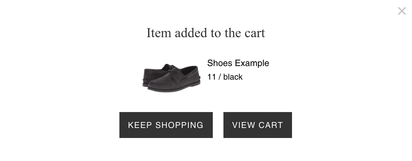
Change button bg color and text color for keep shopping pop-up
<style>
/* Change button bg color and text color for keep shopping pop-up */
.btn {
background-color: #7c9d6d !important;
color: white !important;
}
</style>When keep shopping button is pressed go to selected URL
<script>
/* When keep shopping button is pressed go to selected url */
function bcpoDone() {
bcpo.$(document).on('click', '.bcpo-modal-close-link', function (e) {
window.location = 'https://myshopify.com/';
});
}
</script>
When keep shopping button is pressed Refresh page
<script>
/* When keep shopping button is pressed Refresh page */
function bcpoDone() {
bcpo.$(document).on('click', '.bcpo-modal-close-link', function () {
window.location.reload();
});
}
</script>
Change file upload button styling
<style>
/* change file upload button styling */
#bcpo .bcpo-file input {
margin: 0 !important;
max-width: 100% !important;
line-height: 1 !important;
height: auto !important;
cursor: pointer !important;
background: transparent !important;
border: 0 !important;
padding: 4px 0 !important;
}
#bcpo .bcpo-file input::-webkit-file-upload-button {
background: white !important;
color: black !important;
border: 1px solid #A0A0A0 !important;
border-radius: 4px !important;
padding: 5px 20px !important;
cursor: pointer !important;
}
</style>
Hide Options/ Unavailable Options
To topHide Selected Product Option Value
<style>
/* hide selected product option value */
.bcpo-value {
display: none !important;
}
</style>
Hide Selected Price add-on Value on Product Page
<style>
/* hide selected price add-on value on product page */
.bcpo-addon {
display: none !important;
}
</style>
Hide unavailable variants in 2nd and 3rd product option, always show variants in first product option without sold-out styling
This will keep all of the values visible for the first product option with no sold-out styling, and hide all unavailable values for the second product option.
 <style>
/* hide unavailable variants in 2nd and 3rd product option, always show variants in first product option without sold out styling */
#bcpo .selector-wrapper:nth-child(2).bcpo-images div.bcpo-image-parent,
#bcpo .selector-wrapper:nth-child(2).bcpo-colors div.bcpo-color-parent,
#bcpo .selector-wrapper:nth-child(2).bcpo-buttons .single-option-selector label {
border: 1px solid #a0a0a0;
}
#bcpo .selector-wrapper:nth-child(2).bcpo-images div.bcpo-image-parent label,
#bcpo .selector-wrapper:nth-child(2).bcpo-colors div.bcpo-color-parent label,
#bcpo .selector-wrapper:nth-child(2).bcpo-buttons label {
opacity: 1 !important;
}
#bcpo .selector-wrapper:nth-child(2).bcpo-colors div.bcpo-disabled:hover,
#bcpo .selector-wrapper:nth-child(2).bcpo-colors div.bcpo-really-disabled:hover,
#bcpo .selector-wrapper:nth-child(2).bcpo-images div.bcpo-disabled:hover,
#bcpo .selector-wrapper:nth-child(2).bcpo-images div.bcpo-really-disabled:hover,
#bcpo .selector-wrapper:nth-child(2).bcpo-buttons label.bcpo-disabled:hover,
#bcpo .selector-wrapper:nth-child(2).bcpo-buttons label.bcpo-really-disabled:hover {
border: 1px solid black !important;
}
#bcpo .selector-wrapper:nth-child(3) .bcpo-disabled,
#bcpo .selector-wrapper:nth-child(3) .bcpo-really-disabled {
display: none !important;
}
#bcpo .selector-wrapper:nth-child(4) .bcpo-disabled,
#bcpo .selector-wrapper:nth-child(4) .bcpo-really-disabled {
display: none !important;
}
</style>
This code only works to display the first product options variants as in stock if the product option is image or color swatches, and normal dropdowns. It doesn’t work with enhanced dropdowns as the first product option
Hide unavailable variants
This will hide variants that aren’t available in any combinations.
<style>
/* hide unavailable variants */
.bcpo-really-disabled {
display: none !important;
}
</style>
Hide unavailable variants in 2nd product option
This will keep all of the values visible for the first product option and hide all unavailable values for the second product option. The values in the first product option will still show the sold-out styling.
<style>
/* hide unavailable variants in 2nd product option */
#bcpo .selector-wrapper:nth-child(3) .bcpo-disabled,
#bcpo .selector-wrapper:nth-child(3) .bcpo-really-disabled {
display: none !important;
}
</style>
Hide unavailable variants in 2nd & 3rd product option
This will keep all of the values visible for the first product option and hide all unavailable values for the second & 3rd product option. The values in the first product option will still show the sold-out styling.
<style>
/* hide unavailable variants in 2nd & 3rd product option */
#bcpo .selector-wrapper:nth-child(3) .bcpo-disabled,
#bcpo .selector-wrapper:nth-child(3) .bcpo-really-disabled {
display: none !important;
}
#bcpo .selector-wrapper:nth-child(4) .bcpo-disabled,
#bcpo .selector-wrapper:nth-child(4) .bcpo-really-disabled {
display: none !important;
}
</style>
Change crossed-out style color
<style>
/* change crossed-out styling color */
.bcpo-xs .bcpo-front-button-label.bcpo-disabled::before, .bcpo-xs .bcpo-color-parent.bcpo-disabled::before, .bcpo-xs .bcpo-image-parent.bcpo-disabled::before,
.bcpo-xs .bcpo-front-button-label.bcpo-disabled::after, .bcpo-xs .bcpo-color-parent.bcpo-disabled::after, .bcpo-xs .bcpo-image-parent.bcpo-disabled::after {
background: black !important;
}
</style>
Change sold-out style to line-through text
<style>
/* Change sold-out style to line-through text */
#bcpo .bcpo-buttons label.bcpo-front-button-label.bcpo-disabled {
text-decoration: line-through !important;
}
</style>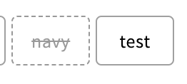
Disable zoom on IOS
On IOS the browser will zoom in if the font size is less than 16px. Replace the “<meta name” code with the one below to prevent the browser from zooming in. You can also change the font size to 16px to avoid zooming in the first place.
<meta name="viewport" content="width=device-width, initial-scale=1, maximum-scale=1">Change the Selections text in the Checkout.
To topReplace the text “Selections” with the text you want to appear in checkout.
<script>
/* replace the text "Selections" with the text you want to appear in checkout */
window.bcpoSelections = 'Selections';
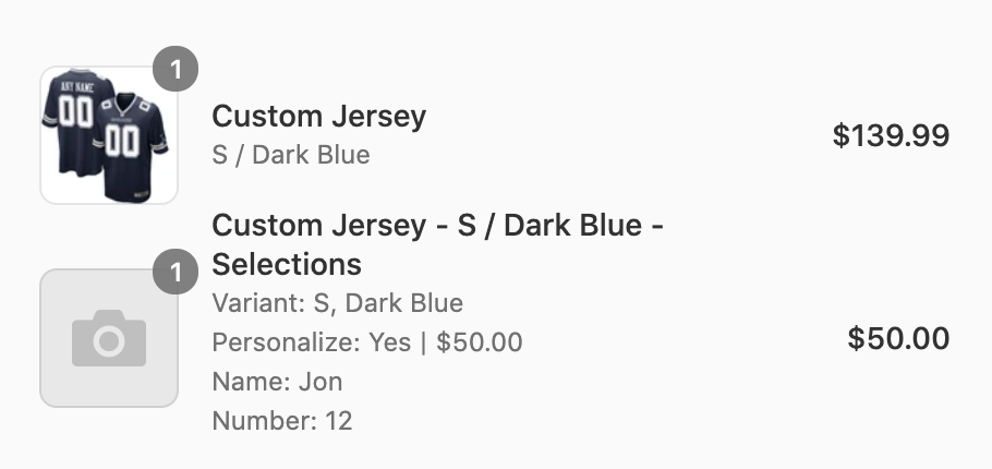
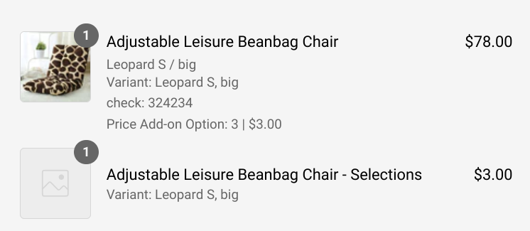
</script>Move the line-item properties to the original product line-item
<script>
/* replace the text "Selections" with the text you want to appear in checkout */
functionbcpoFirst() {
bcpo_settings.properties_on_original = true;
}
</script>Usually, the properties are on the line-item with the custom price:
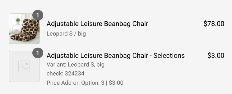
When the feature is enabled, the properties are added to the original line-item:
Change styling for different sized screens
Add this code after the <style> tag and before the rest of the code
@media (max-width: 480px) {@media (min-width: 749px) and (max-width: 1003px) {For example
<style>
@media (min-width: 749px) and (max-width: 1003px) {
#bcpo .bcpo-images div.bcpo-image-parent {
width: 72px !important;
}
#bcpo label.bcpo-front-image-label,
#bcpo input.bcpo-front-image-label {
height: 68px !important;
}
}
</stye>
Add Product Option data to the notes
<script>
/* add product option data to the notes */
function bcpoFirst() {
bcpo_settings.options_in_note = 'on';
}
</script>
Remove colon next to product option title
<script>
/* Remove colon next to product option title */
function bcpoDone() {
bcpo.$('.bcpo-title').each(function (i, el) {
var $el = bcpo.$(el);
$el.html($el.html().replace(/:$/, ''));
});
}
</script>
Add a red asterisks next to the required options.
<script>
/* Add a red asterisks next to the required options */
function bcpoDone() {
bcpo_data.shopify_options.forEach(function (o) {
var $el = bcpo.$('[data-unique="' + o.unique + '"]').find('.bcpo-title');
$el.html($el.html() + '<span style="color: red;">*</span>');
});
bcpo_data.virtual_options.forEach(function (o) {
var $el = bcpo.$('[data-unique="' + o.unique + '"]').find('.bcpo-title');
if (o.required) $el.html($el.html() + '<span style="color: red;">*</span>');
});
}
</script>
Currency Fix (this code will fix some currency converter issues)
Make sure the shop currency is set to your stores currency. For example USD, GBP etc.
<script>
/* Currency fix */
function bcpoFirst() {
bcpo_settings.shop_currency = 'USD';
}
</script>
Turn off Taxes for price add-ons
<script>
/* Turn off taxes for price add-ons */
function bcpoDone() {
bcpo_settings.tax_price_addons = 'off';
}
</script>
Limit file upload type to pdf .ai files only
<script>
/* Limit file upload type to pdf .ai files only */
function bcpoDone() {
bcpo.$('[type="file"]').attr('accept', 'application/pdf');
}
</script>
Limit file upload type to image files only
<script>
/* Limit file upload type to image files only */
function bcpoDone() {
bcpo.$('[type="file"]').attr('accept', 'image/*');
}
</script>
Turn on Shop Pay Installments message
Our price add-ons won’t aren’t compatible with the installment price. If the Shop Pay installments are turned on they will be an incorrect price, which is why our app hides this message.
<script>
/* Show Shop Pay Installments message */
function bcpoFirst() {
bcpo_settings.show_installment_terms = 'on';
}
</script>
Disable Discount Codes in Checkout
<script>
/* Disable Discounts Codes in Checkout */
function bcpoFirst() {
bcpo_settings.disallowDiscountCodesInCheckout = true;
}
</script>
Fix add to cart text when it wrongly shows as sold out
<script>
/* Fix add to cart text */
function bcpoDone() {
var atc = bcpo.$('.product-single__add-to-cart > [name="add"]');
setInterval(function () {
if (bcpo.variant.available) {
atc.attr('disabled', false).removeClass('disabled').find('.btn__add-to-cart-text').html('Add to Cart');
} else {
atc.attr('disabled', 'disabled').addClass('disabled').find('.btn__add-to-cart-text').html('Sold Out');
}
}, 900);
}
</script>https://www.w3schools.com/js/js_functions.asp
function bcpoFirst () { /* added code*/ }<script>
/* make shipping required and show shop pay */
function bcpoFirst() {
bcpo_settings.requires_shipping = true;
bcpo_settings.show_installment_terms = 'on';
}
</script>