Here are some code snippets to help you change the look of your size chart.
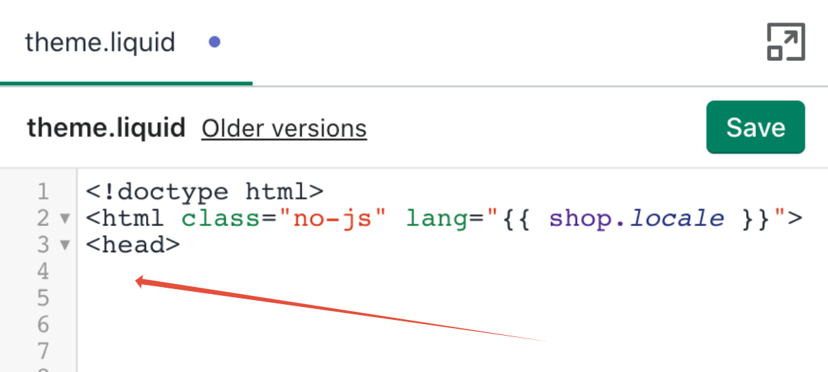
How to add code to your theme.liquid file
To topYou can place this code after the <head> tag in your theme.liquid file. More info
General styling
To topChange the width of the size chart (normally 700px)
<style>
/* Change the width of the size chart */
.scr-modal {
max-width: 700px !important;
}
</style>
Size chart popup window styling
To topChange the background color of the size chart
<style>
/* Change the background color of the size chart */
.scr-modal {
background: black !important;
}
</style>
Change the font for all the text in the size chart popup
<style>
/* Change the font for all the text in the size chart  popup*/
.scr .bottom-description, .scr .top-description, .scr h2, .scr table {
font-family: Helvetica, "Helvetica Neue", Arial, "Lucida Grande", sans-serif !important;
}
</style>
Change the styling of the text in the size chart table (font, size, color)
<style>
/* Change the styling of the text in the size chart table */
.scr table td,
.scr table th {
font-family: 'Futura', Arial, Helvetica, sans-serif !important;
font-size: 16px !important;
color: black !important;
}
</style>
Change the font of the description
<style>
/* Change the font of the description */
.scr span {
font-family: 'Futura', Arial, Helvetica, sans-serif !important;
}
</style>
Size Chart link and icon styling
To topChange the color of the size chart link text. Replace the color with the color you want
<style>
/* Change the color of the size chart link text */
div .scr-open-size-chart {
color: #000000 !important;
}
</style>
Reduce the space above and below the size chart icon and link
<style>
/* Reduce the  space above and below the size chart icon and link */
div button.scr-open-size-chart {
margin-top: 0px !important;
margin-bottom: 0px !important;
padding-top: 0px !important;
padding-bottom: 0px !important;
}
</style>
If you have already added the code above and you need more space. Add the code below also.
<style>
/* Reduce the space above and below the size chart icon and link MORE */
.best-fit-size-chart {
margin-top: -10px !important;
margin-bottom: -10px !important;
}
</style>
Change the font size of the size chart link text
<style>
/* Change the font size of the size chart link text */
div .scr-open-size-chart {
font-size: 18px !important;
}
</style>
Center size chart link and icon on the product page
<style>
/* center size chart link and icon on the product page */
div .best-fit-size-chart {
text-align: center !important;
}
</style>
Change the size of the size chart icon
<style>
/* Change the size of the size chart icon */
div .scr-open-size-chart::before {
height: 17px !important;
width: 20px !important;
}
</style>
Change the size chart and icon to white (dark themes)
<style>
/* Change the size chart and icon to white (dark themes) */
div .scr-open-size-chart::before {
filter: invert(1);
}
</style>
<style>
div .scr-open-size-chart {
color: #ffffff !important;
}
</style>
Size Chart table styling
To topCenter size chart data in the size chart
<style>
/* Center size chart data in the size chart */
.scr table td,
.scr table th {
text-align: center !important;
}
</style>
Remove vertical lines on the size chart
<style>
/* Remove vertical lines on the size chart */
.scr-table {
border: 0 !important;
}
</style>
Make the size chart columns equal width
<style>
/* Make the size chart columns equal width */
.scr table {
table-layout: fixed !important;
}
</style>
Change the size chart gridline color
<style>
/* Change the size chart gridline color */
.scr-modal table td,
.scr-modal table th {
border: 1px solid #c5c5c5 !important;
}
</style>
Bold text for first column of size chart table
<style>
/* Bold text for first column of size chart table*/
.scr.basic table tr td:first-child,
.scr.basic table tr th:first-child {
font-weight: bold !important;
}
</style>
Change the font size of the size chart table text for mobile devices (screens under 500 px)
<style>
/* Change the font size of the size chart table text for mobile devices */
@media (max-width: 500px) {
.scr table td, .scr table th {
font-size: 12px !important;
}
}
</style>
Change the font size of the size chart table text for tablets (screens between 500px -768px)
<style>
/* Change the font size of the size chart table text for tablets */
@media (max-width: 768px) {
.scr table td, .scr table th {
font-size: 16px !important;
}
}
</style>
Other styling
<style>
/* change the font and border style of the whole table */
.scr-modal table td,
.scr-modal table th {
font-family: Arial !important;
border: 1px solid black !important;
}
/* make the first row black with white, centered text */
.scr-modal table tr:first-child td,
.scr-modal table tr:first-child th {
background: black !important;
color: white !important;
text-align: center !important;
}
/* give the rows after the first row a white background and center the text */
.scr-modal table tr:nth-child(n+2) td,
.scr-modal table tr:nth-child(n+2) th {
background: white !important;
text-align: center !important;
}
</style>
Black background and white text for the size chart
<style>
/* Black background and white text for the size chart */
.scr-modal {
background: black !important;
}
</style>

<style>
.scr-modal .scr-close:before, .scr-modal .scr-close:after {
background-color: white !important;
}
</style>

<style>
.scr h2{
color: #ccc !important;
}
</style>

<style>
.scr .top-description p, .scr .bottom-description p {
color: #ccc !important;
}
</style>

<style>
/* change the font and border style of the whole table, white text, center */
.scr-modal table td,
.scr-modal table th {
border: 1px solid #999 !important;
}
/* make the first row black with white, centered text */
.scr-modal table tr:first-child td,
.scr-modal table tr:first-child th {
background: black !important;
color: #ccc !important;
text-align: center;
}
/* give the rows a black background and center the text, white text, center */
.scr-modal table tr:nth-child(n+2) td,
.scr-modal table tr:nth-child(n+2) th {
background: black !important;
color: #ccc !important;
text-align: center !important;
}
</style>
Change styling for different sized screens
Add this code after the <style> tag and before the rest of the code
@media (max-width: 480px) {@media (min-width: 749px) and (max-width: 1003px) {For example
<style>
@media (max-width: 480px) {
div .best-fit-size-chart {
text-align: center !important;
}
}
</stye>